
Options on stocks with a low share price tend to be overpriced. Equity options (at 100 shares a pop) are quite big for a small retail trader. So we might say there is excess retail demand for options on cheap stocks – which would result in them being overpriced.Shall we do some analysis on a *really dumb* factor which might predict relative returns in stocks?
“Are cheap stocks expensive?” A research thread 👇👇👇 — Robot James (@therobotjames) November 12, 2020
Are Low-Priced Stocks Actually Expensive?
The AMZN share price is $3k+. There are Robinhooders who can’t afford a single stock. Do we see the same effect in Stocks as we do in the options? I’m going to analyze this in R – using datasets from the Robot Wealth research lab.Data Cleaning and Preparation
My raw price data looks like this: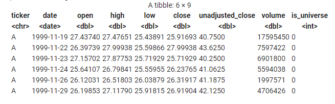
- The OHLC points are adjusted for splits and dividends.
- The unadjusted_close price is the price the stock actually closed on that day
- If the stock didn’t trade that day we still have a row. It has
volume = 0 - If the stock was not in the index that day then
is_universe = 0
Always keep stuff simple for yourself. At the start of a piece of analysis, you’re just trying to quickly disprove an idea. Most ideas are bad and the market is super-efficient. So make life easy, move fast, and disprove fast.Borrowing the language of machine learning for my trivial analysis (because it’s precise) I now need to prepare:
- the target (the thing I am trying to predict)
- the feature (the thing I hope is predictive)
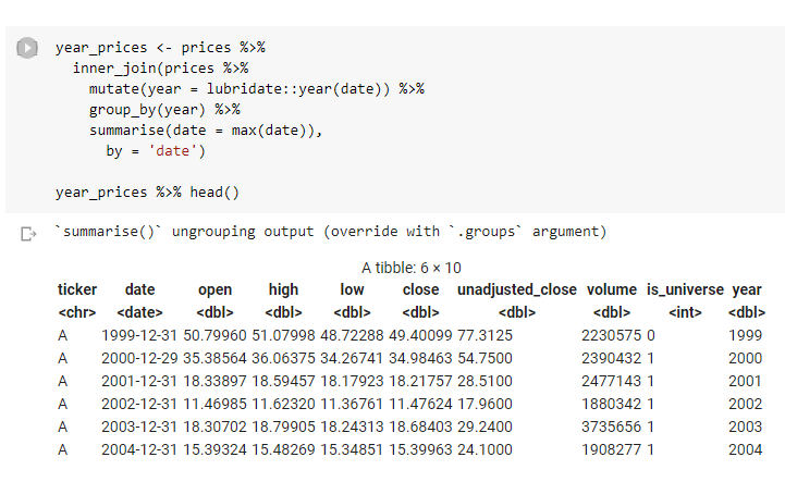
 I’ve calculated those for all the stocks, including on days when those stocks weren’t in the Russell 1000 index.
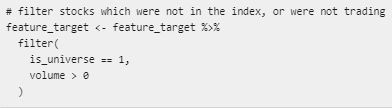
So now I filter out the days when the stock wasn’t in the index and days when a given stock didn’t trade (due to a trading halt or similar)
I’ve calculated those for all the stocks, including on days when those stocks weren’t in the Russell 1000 index.
So now I filter out the days when the stock wasn’t in the index and days when a given stock didn’t trade (due to a trading halt or similar)
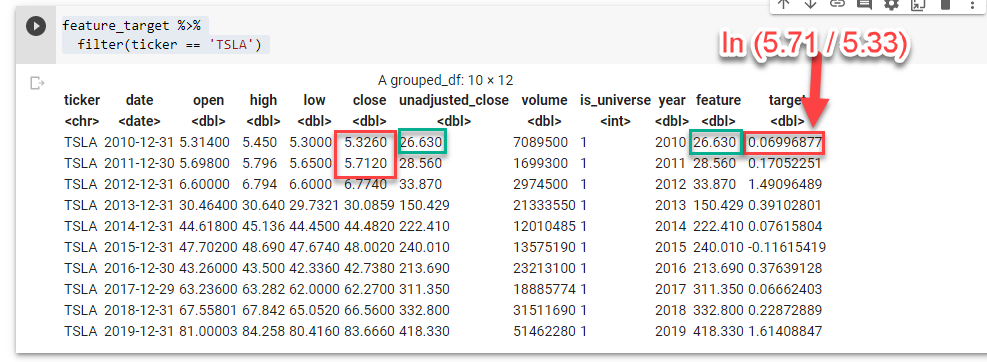
- The feature is just the unadjusted close at the end of the year.
- The target is the log returns over the next year.
Scaling and Sorting
Now we’re ready to do some scaling and sorting. We don’t want to work with the raw feature. We’re looking to answer a very broad question here, and large numbers are our friends. So we want to sort and group our data so we can aggregate it effectively. We’ll scale our feature by sorting each stock into one of 10 buckets each year- Bucket 1 will contain the stocks in the index with the lowest (unadjusted) share price that year
- Bucket 10 will contain the stocks in the index with the highest (unadjusted) share price that year
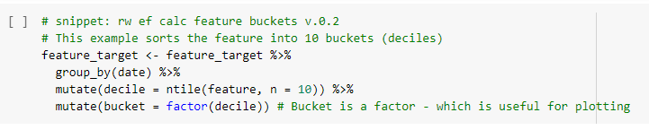
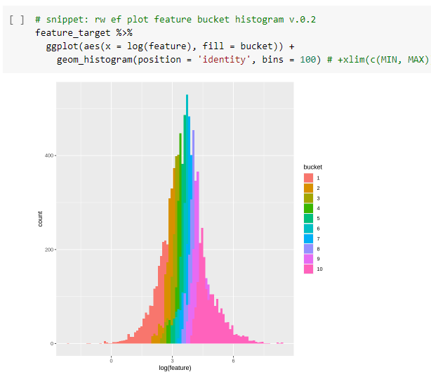 Now we’ve reduced our raw feature to 10 buckets. That will be helpful.
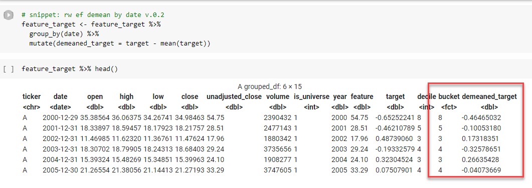
Our next task is to think about scaling the target.
We’re really more interested in relative (rather than absolute) returns: “Did the cheap stuff perform better than the expensive stuff this year?”
So we “de-mean” the target by subtracting the mean returns of all stocks that year from the yearly returns for each stock in our universe.
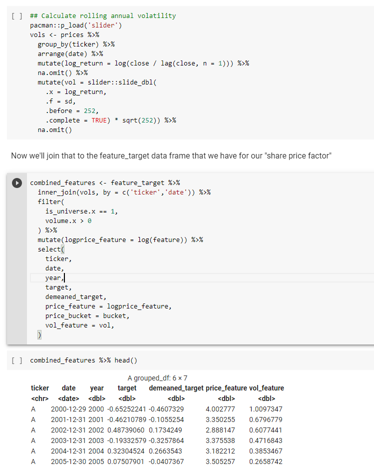
The data now look like this. I’ve highlighted the scaled feature (
Now we’ve reduced our raw feature to 10 buckets. That will be helpful.
Our next task is to think about scaling the target.
We’re really more interested in relative (rather than absolute) returns: “Did the cheap stuff perform better than the expensive stuff this year?”
So we “de-mean” the target by subtracting the mean returns of all stocks that year from the yearly returns for each stock in our universe.
The data now look like this. I’ve highlighted the scaled feature (bucket) and target (demeaned_target.)
 Now we want to see if the really low priced stuff that ended up in bucket 1 had lower returns than the really high priced stuff that ended up in bucket 10.
So we take our observations, group by bucket and plot the mean of next years (de-meaned) returns for each bucket.
Now we want to see if the really low priced stuff that ended up in bucket 1 had lower returns than the really high priced stuff that ended up in bucket 10.
So we take our observations, group by bucket and plot the mean of next years (de-meaned) returns for each bucket.
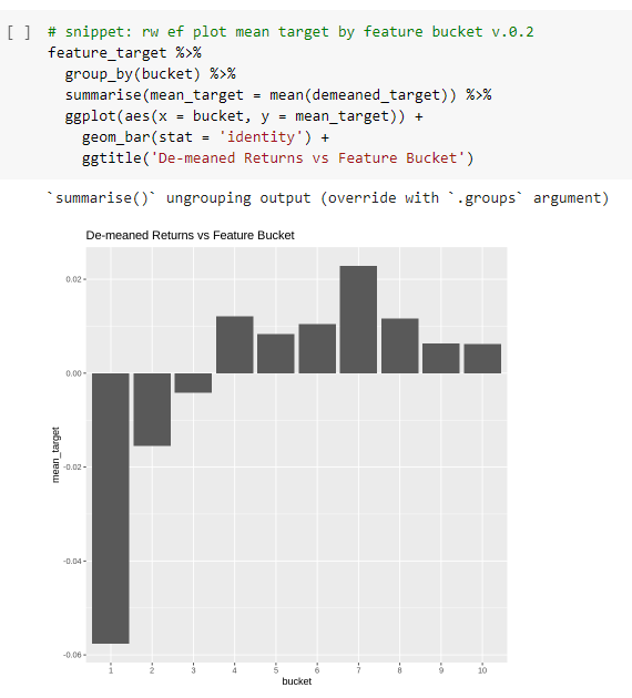
Results? Kinda
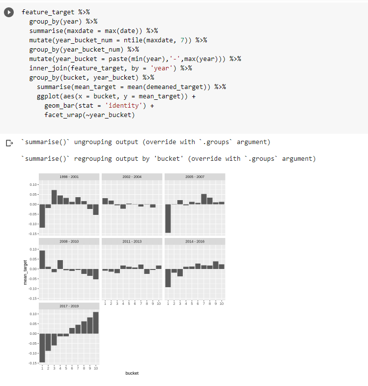
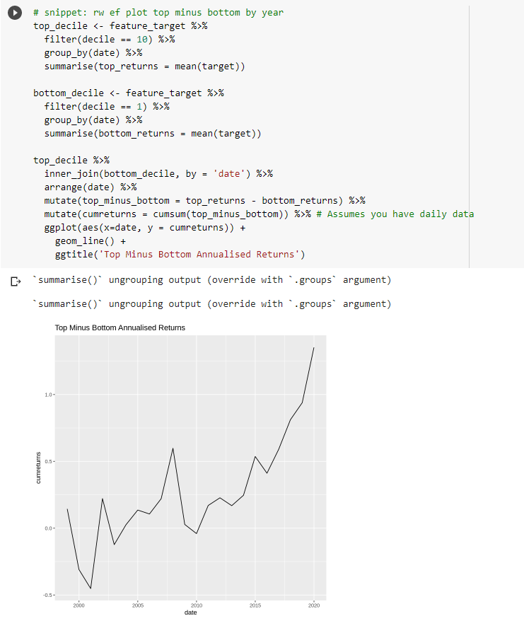
Interestingly… we do appear to see – at least over the whole sample – the annual return of the cheap stocks is significantly (6-7%) lower than the returns of the more expensive stocks. I haven’t lost interest yet… So let’s create one of those plots for each of the 22 years in the sample. We want to get a feel for whether we see this pattern consistently.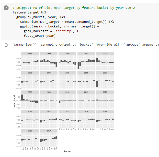
- Get more acquainted with unadjusted close data to ensure it’s correct and I’m not introducing helpful bias 2 Try to isolate this from any other casual factors we already know about (size, reversion from big moves, beta effect)
But is this an interesting or unique finding?
We know that a low stock price doesn’t actually cause future returns to be lower. That would be silly. But we thought that stocks with very low share prices may be attractive to a low capitalized seeker of stock returns – whose marginal demand may bid up these stocks. This is plausible. And we would like it to be true (cos then we’ve found a new effect we might harness.) But we can’t always get what we want. So we must ask: “Is this something we already know about?” Economic intuition comes before statistics. What do we already know about that might be causing this? Well, it is well known that high volatility assets tend to have very poor long-run returns.You can read about this in Antti Ilmanen’s Expected Returns here…You think you’ve identified a new, useful predictive factor for trading…
But is it really new? Or just another way of looking at something you already know about? How might you tell? Here are some simple ways… A research thread 👇👇👇 https://t.co/q9ga3S6zbd — Robot James (@therobotjames) November 27, 2020
 We suspect high vol assets are attractive to those who like lotterylike “YOLO” payoffs or who dislike leverage or can’t access it easily. This creates excess demand for highly volatile stocks, which makes them more expensive, which makes their future expected returns lower.
So do stocks with lower share prices tend to underperform simply because they tend to be more volatile stocks? Or is there something else going on? Let’s look…
First, we calculate a volatility factor – which will just be the annualised volatility of the stock over the last 252 trading days (1 year).
I’m using the same dataset as in the linked thread at the top…
We suspect high vol assets are attractive to those who like lotterylike “YOLO” payoffs or who dislike leverage or can’t access it easily. This creates excess demand for highly volatile stocks, which makes them more expensive, which makes their future expected returns lower.
So do stocks with lower share prices tend to underperform simply because they tend to be more volatile stocks? Or is there something else going on? Let’s look…
First, we calculate a volatility factor – which will just be the annualised volatility of the stock over the last 252 trading days (1 year).
I’m using the same dataset as in the linked thread at the top…
 Now we want to answer the question:
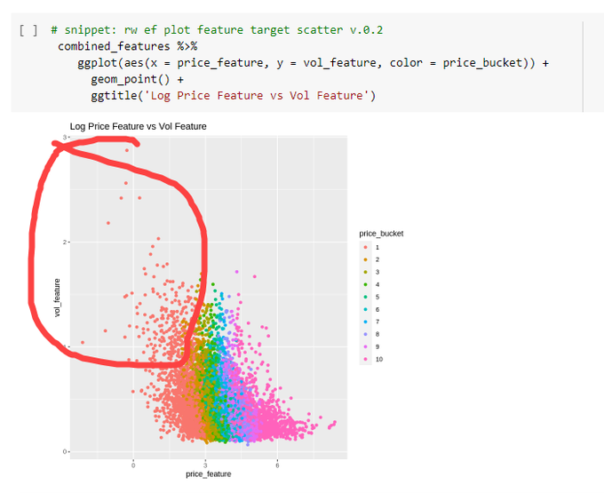
Do stocks with low share price also tend to be high volatility stocks (and vice versa)?A scatterplot is a useful tool for this. For each yearly stock observation plot its past volatility on the y-axis and the log share price on the x-axis.
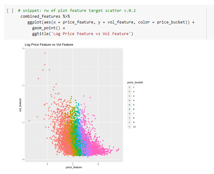 It’s quite clear that stocks with low share prices tend to be higher volatility stocks. This suggests what we are seeing could well be a high-volatility effect.
 Now we want to see if our share price effect goes away if we control for the high volatility effect.
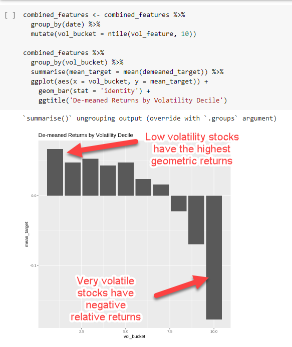
First, let’s look at the volatility effect itself. We sort all our annual stock observations into deciles by rising volatility and plot the mean of their log returns the following year. It’s pretty clear the high vol stuff tends to have crappy returns.
Now we want to see if our share price effect goes away if we control for the high volatility effect.
First, let’s look at the volatility effect itself. We sort all our annual stock observations into deciles by rising volatility and plot the mean of their log returns the following year. It’s pretty clear the high vol stuff tends to have crappy returns.
 What if we filter out the highly volatile stuff from our analysis?
If we only look at the stuff that appears in volatility deciles 1-8, do we still see any “signal” in our share price factor? Do lower volatility stocks with low share prices still have worse returns?
What if we filter out the highly volatile stuff from our analysis?
If we only look at the stuff that appears in volatility deciles 1-8, do we still see any “signal” in our share price factor? Do lower volatility stocks with low share prices still have worse returns?
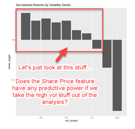 So we:
- filter out all the high vol stocks (vol_bucket <= 8)
- plot the mean log return for each share price bucket for the remaining low and moderate volatility stocks.
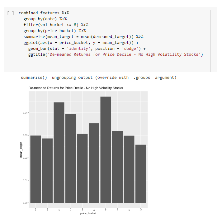 And it no longer looks interesting!
Once we’ve controlled for the high volatility effect, the share price doesn’t seem to have anything interesting to add.
As often happens in the markets, it’s unlikely we’re going to get what we want here. It’s likely we just found another proxy for volatility.
Now, let’s try isolating the high vol stuff. Does the share price allow us to discriminate between high vol stuff with better (less bad?) returns?
And it no longer looks interesting!
Once we’ve controlled for the high volatility effect, the share price doesn’t seem to have anything interesting to add.
As often happens in the markets, it’s unlikely we’re going to get what we want here. It’s likely we just found another proxy for volatility.
Now, let’s try isolating the high vol stuff. Does the share price allow us to discriminate between high vol stuff with better (less bad?) returns?
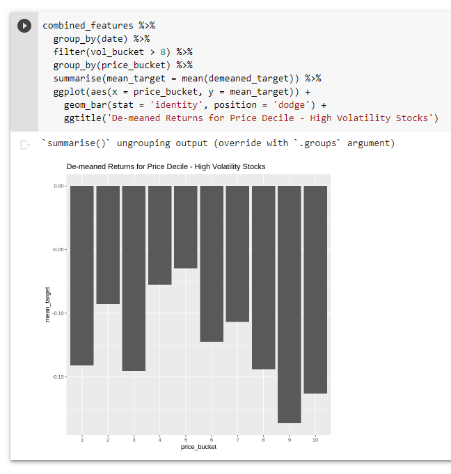 Nope. Doesn’t seem to be anything there either!
At this point, I think we can say that it’s very likely the share price effect we saw isn’t that interesting by itself – it’s really just a proxy for the volatility / “betting-against-beta” effect we already knew about.
Such is the way it goes! 🙂
The good news is we understand the effect better now. The less good news is it’s likely just another crude way of looking at something we already knew about.
Here’s a simple recipe of sorts for doing this kind of thing:
Nope. Doesn’t seem to be anything there either!
At this point, I think we can say that it’s very likely the share price effect we saw isn’t that interesting by itself – it’s really just a proxy for the volatility / “betting-against-beta” effect we already knew about.
Such is the way it goes! 🙂
The good news is we understand the effect better now. The less good news is it’s likely just another crude way of looking at something we already knew about.
Here’s a simple recipe of sorts for doing this kind of thing:
- Use economic intuition to identify what else might explain the effect
- Proxy that other thing as a factor
- Look at the relationship between the two factors (scatterplot is good)
- Control for one effect (as best you can) and see if the other factor still explains returns
Summary
Stocks with low share prices tend to underperform those with higher share prices. Unfortunately, this doesn’t look to be a unique factor. It appears to be almost entirely explained by the fact that stocks with low share prices tend to be higher volatility stocks (a known “betting-against-beta” factor.)Free Case Study:
A wantaway engineer’s journey into professional trading and out again
I went from engineering to an equity partnership at a prop trading firm to running my own systematic trading operation from home in Western Australia.
This case study is the full story – every mistake, every breakthrough, and some things I trade today.


I found this article fascinating. Is there anyway that I could obtain the R code to conduct this analysis?
thanks