We’ve all used on/off type trading signals at some point. But you can nearly always extract more insight with a simple adjustment that focuses on using data efficiently.
Let me show you how using a crypto trend example.
The problem with binary signals
You’ve seen them everywhere.
“If price is above the 20-day moving average, be long. If it’s below, be short.”
That’s a binary signal. It’s either ON or OFF. And while it works (sort of), it’s missing a ton of potential insights.
Why? Three main reasons:
- There’s nothing magical about crossing a threshold. Markets don’t fundamentally change when price crosses a moving average.
- When we collapse all information into two states, we miss potentially valuable nuance.
- It creates weirdly aggressive and abrupt trading. Flipping positions every time you cross a line is hard to justify.
Start with the edge
I always start by trying to understand the underlying edge.
Our signal is trying to measure trend in crypto. So start by asking: “Why would crypto trend?”
A plausible hypothesis is that FOMO drives prices, amplified by leverage and the lack of a firm anchor for fair value.
Next, how do we measure trend?
Simple – it’s when positive returns are followed by more positive returns, and negative returns lead to more negative returns.
A moving average is a reasonable approach. When price is above its moving average, that tells us price has gone up in the recent past.
But that only gives us two states – above or below.
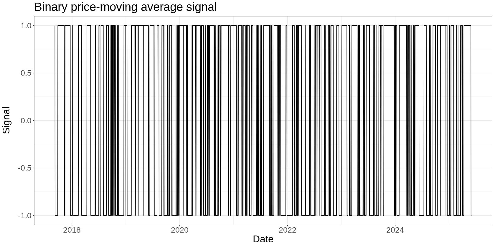
Let’s start by looking at this binary signal. Then we’ll come up with an alternative.
A binary price-moving average signal on BTC would look like this:
And if we plot the signal value vs forward returns, we get this:
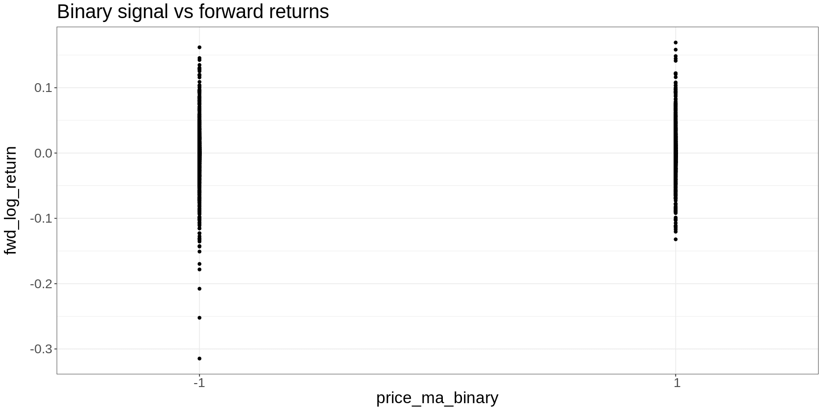
That’s useful, in that it shows that a simple binary trend measure noisily discriminates between high and low future returns. Returns look higher on average when the signal is “on” (1) than when it’s “off” (-1).
But it leaves gaps in our understanding. In particular, what happens in the middle of the relationship?
Trading research is all about understanding an effect first and foremost.
If you start with the mindset of trying to understand the effect, you’ll nearly always end up in the right place. And here, we have a big and obvious gap in our understanding.
So with our “understanding first” mindset, let’s think about how we can fill it.
How can we measure trend in a way that fills in the middle of that relationship? That is, how can we use every data point available to us, rather than just the points at which price crossed the moving average?
This is a key point: when seeking to understand an edge, always maximise the use of your data.
Constructing a binary signal is, in essence, throwing away a huge chunk of information. And financial data is already in short supply.
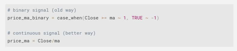
Here’s a slight adjustment to our trend measurement that takes care of this:
Instead of the binary above/below signal, calculate the ratio of price and the moving average. In R, you could do something like this:
This wasn’t some clever trick I had up my sleeve.
It emerged naturally from asking, “How can I measure the strength of the trend at every point, not just when it crosses a threshold?”
This is the same insight, just expressed more fully. When price is further above the moving average, the ratio will be higher (stronger uptrend). When it’s below, the ratio will be lower (stronger downtrend).
But the real benefit is that this will give you a signal value for every single day.
Furthermore, the signal can take on any value (as opposed to only two), which means we can do more interesting analysis.
Here’s what it looks like:
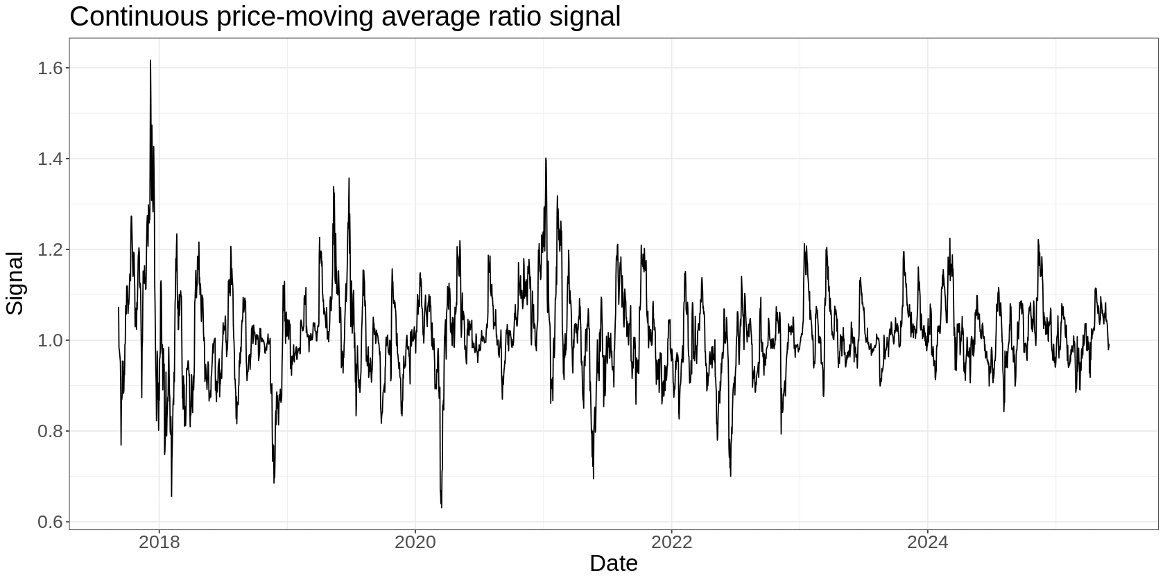
It’s a good idea to always plot these things and look for obvious changes in the signal over time.
In this case, we might say that the signal was more volatile earlier in its history, so we might want to vol-scale it to account for that. We’ll gloss over that for now.
Let’s now look at a scatter plot of our continuous signal:
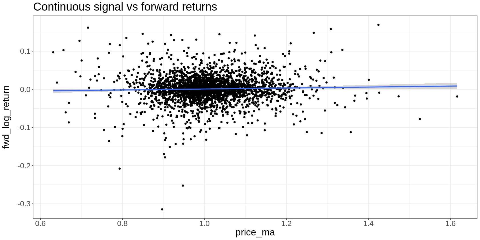
This has filled in the relationship and told us some interesting things we couldn’t infer from the binary signal:
- The relationship is somewhat linear – as our trend signal increases, so do future returns (on average)
- The relationship is very noisy (welcome to trading!)
We now understand more than we did. And this gives us clues for how we might trade this:
- Since the relationship is roughly linear, we might scale position size by the magnitude of the feature.
- Since it’s very noisy (everything is), we set proper expectations around short-term return variance.
At this point, we might want to collapse our data into something more discrete – this helps us highlight average effects, but the downside is that it hides the variance. It’s just another view on our effect.
A good way to do this is to split our signal values into 10 equal buckets. The bottom 10% of values go into bucket 1, the next 10% in bucket 2, and so on.
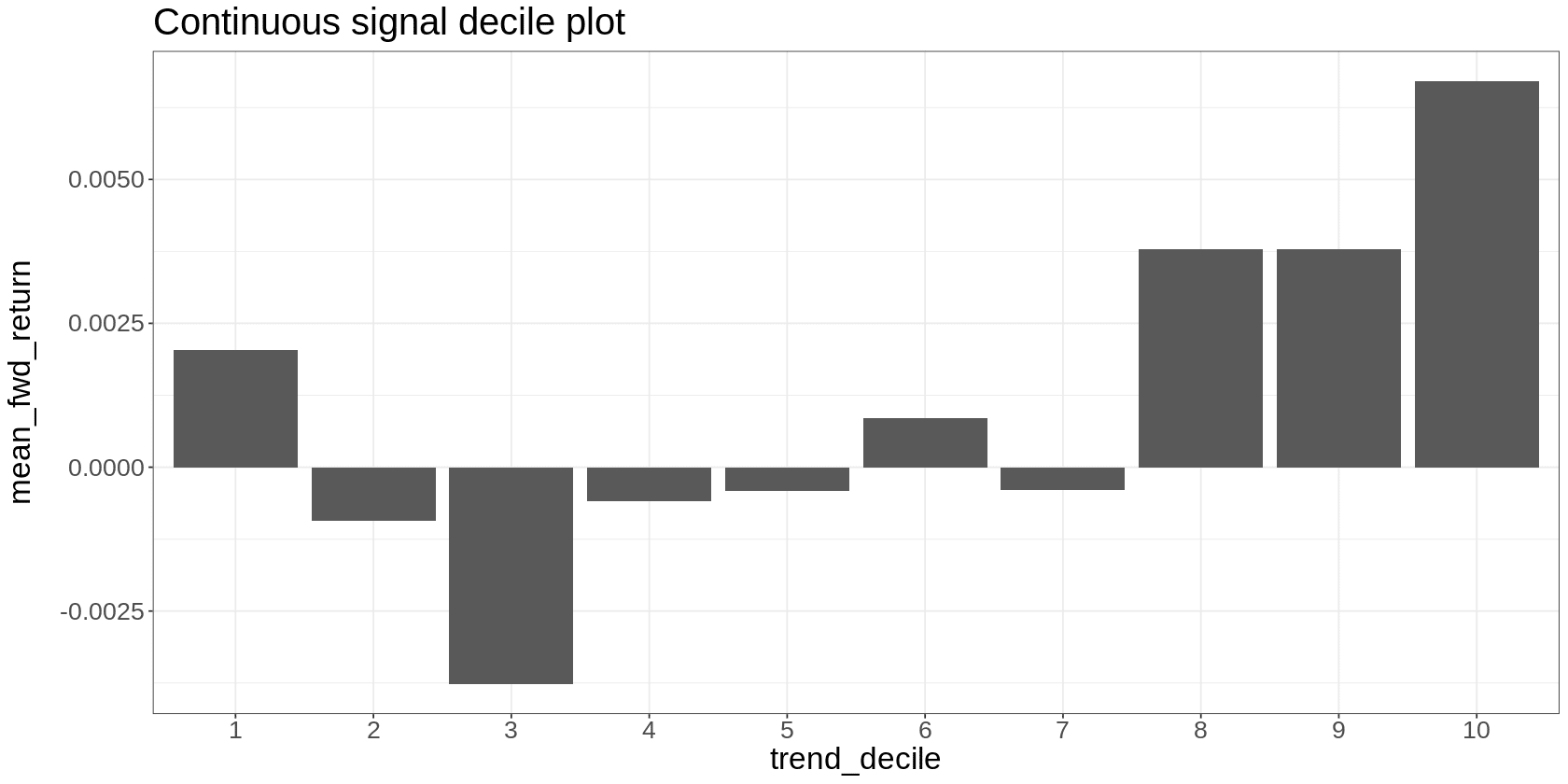
You can see how this sort of analysis highlights average effects that are hard to make out in the scatter plot.
Here we see a noisy and very imperfect relationship between the signal bucket and future returns.
We can also see a reversal off extreme negative returns – see the positive return in bucket 1. We might want to include that in our strategy explicitly, or dig into it as its own thing.
The interesting thing is that we’d never have noticed this if we used the binary signal.
But by making better use of our data, the effect starts to reveal itself.
This insight wasn’t the result of clever strategy design. It appeared because I was focused on understanding the effect.
Finally, I like to plot a timeseries of cumulative returns to our signal. This looks like a backtest, but it’s not – it’s just the returns attributed to the signal and doesn’t account for costs or real-world trading constraints.
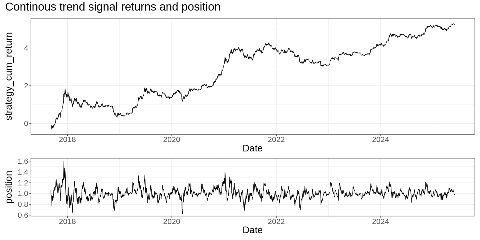
For comparison, here’s what the binary signal looks like:
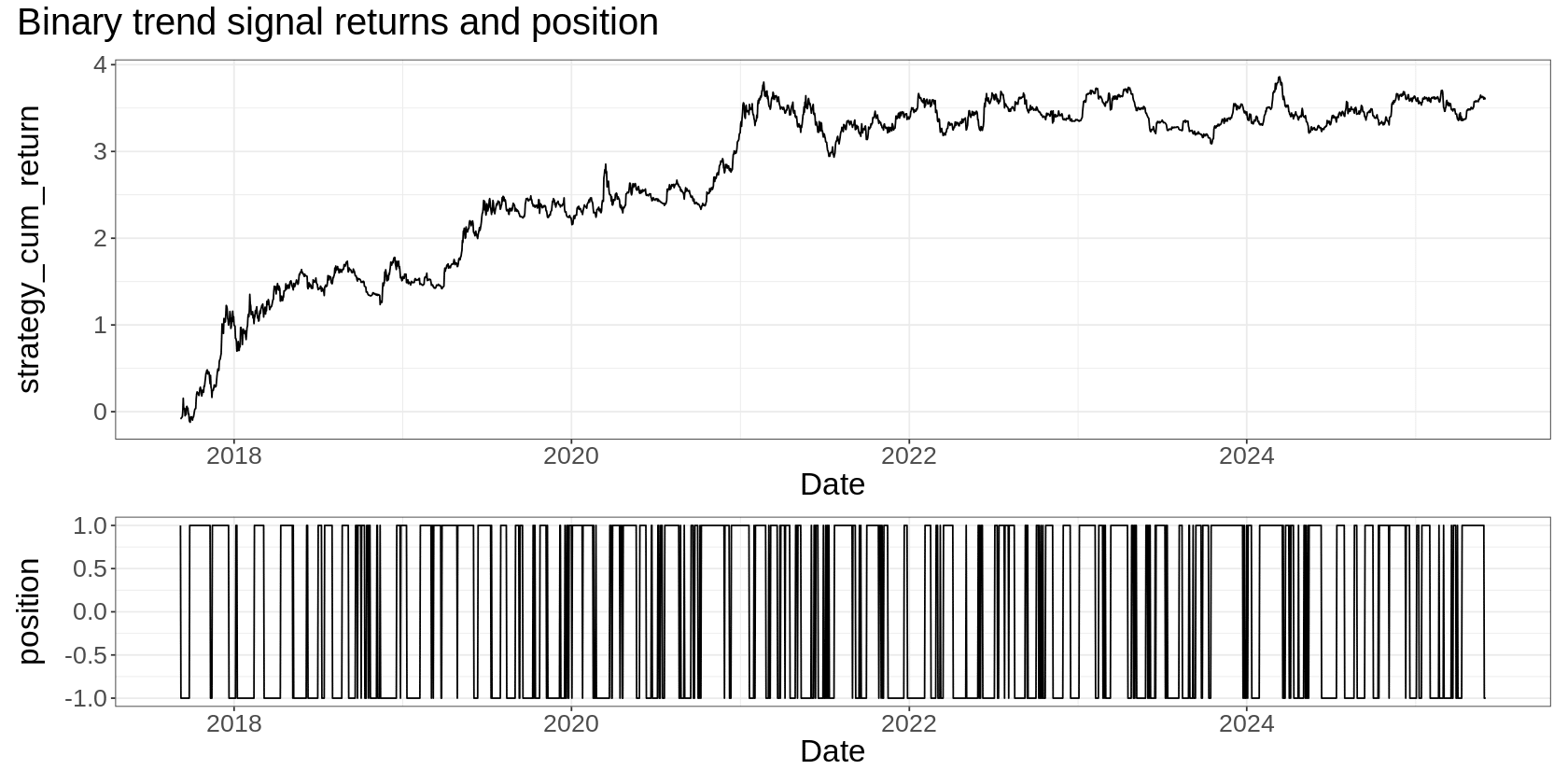
(I scaled the two time-series plots so that they realised the same volatility – just makes comparison easier).
Summary
We all make the mistake of jumping straight to strategy design. No one is more guilty of this than me. But that’s getting things backward. The better approach is to:
- Focus on understanding your edge first,
- Use all your data, not just some of it,
- Let the right strategy emerge from your understanding.
When you adopt this mindset, you’ll find that:
- You spend less time on complex solutions that aren’t needed,
- You discover nuances in your edge that you’d otherwise miss,
- The optimal trading approach becomes obvious rather than forced.
This approach deepens your understanding of how your edge actually works. And that understanding often leads to refinements and entirely new trading ideas that you’d never discover otherwise.
Want the code?
It’s all in this notebook. You can run it yourself in Colab by clicking the “Open in Colab” button and then running all the cells one by one.


1 thought on “Trading Signals in High Definition”